Rescuing Core Product Value
This cross-European platform reimagined the mortgage process in seven countries, making it simpler for borrowers and smarter for advisors, with tools designed to drive both clarity and conversion.
Roles
Lead Product Designer
User Experience (UX) Designer
Interaction (IxD) Designer
User Interface (UI) Designer
Information Architect
Deliverables
User Research Summary
Architecture & Form Logic Review
Journey Maps & Task Flows
Updated Feature Flow
Sketches & Low-Fidelity Wireframes
Interactive Prototype
Design Handoff & Dev Support
Recommendations for What’s Next
Project Specifications
Figma
Miro
Lyssna (research tool)
Paper
Pen
TL;DR
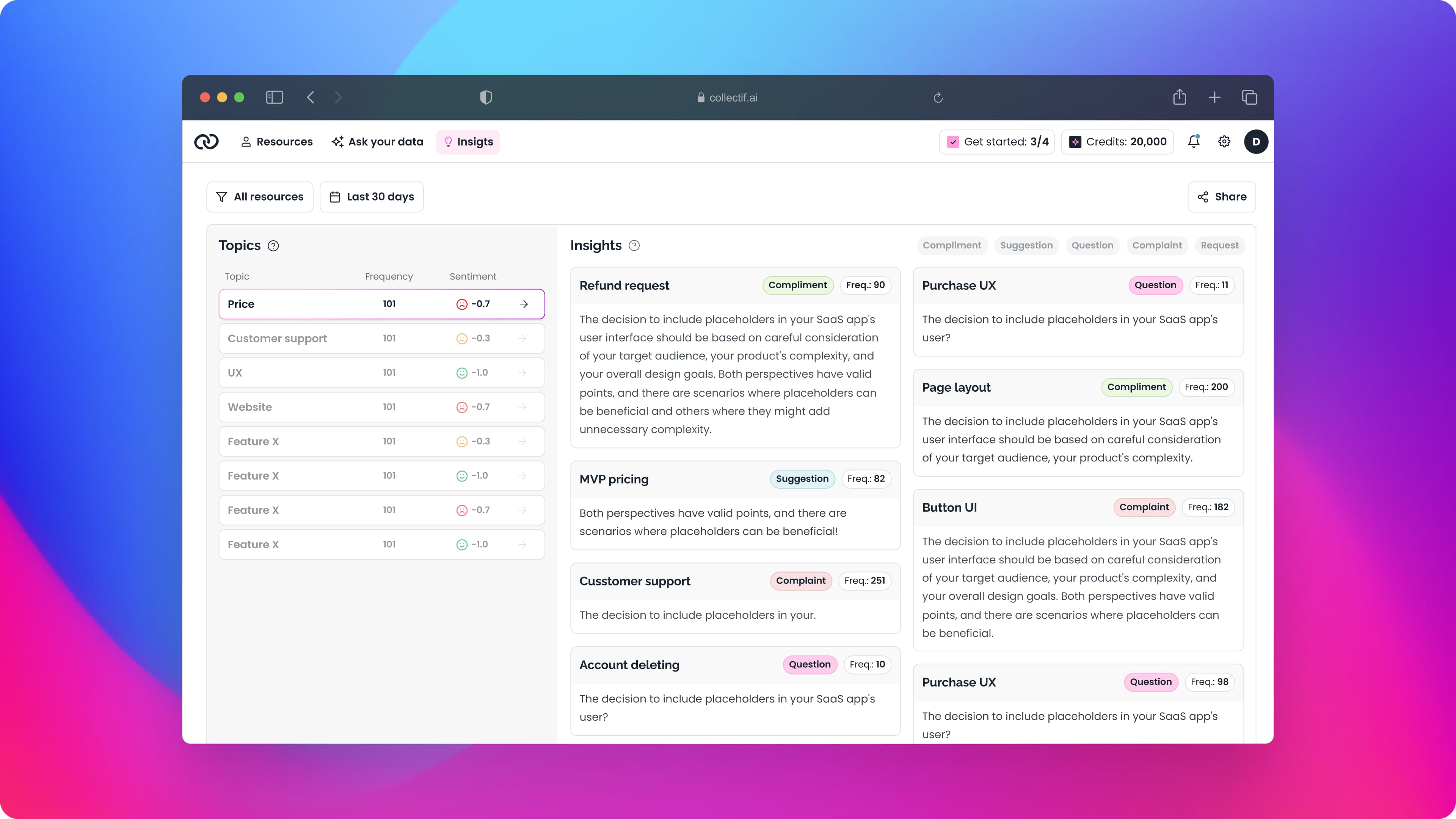
The mortgage Simulator was positioned as a key feature but saw little to no usage from advisors—it didn’t reflect their real workflows and was too complex to use efficiently.
As the Lead Product Designer, I conducted interviews, reviewed the tool’s technical architecture, and led a complete redesign focused on speed, clarity, and real-life advising needs. The result was a significantly more usable experience that aligned with how advisors actually work—improving adoption and setting the foundation for long-term product improvements.
Key highlights:
Overview
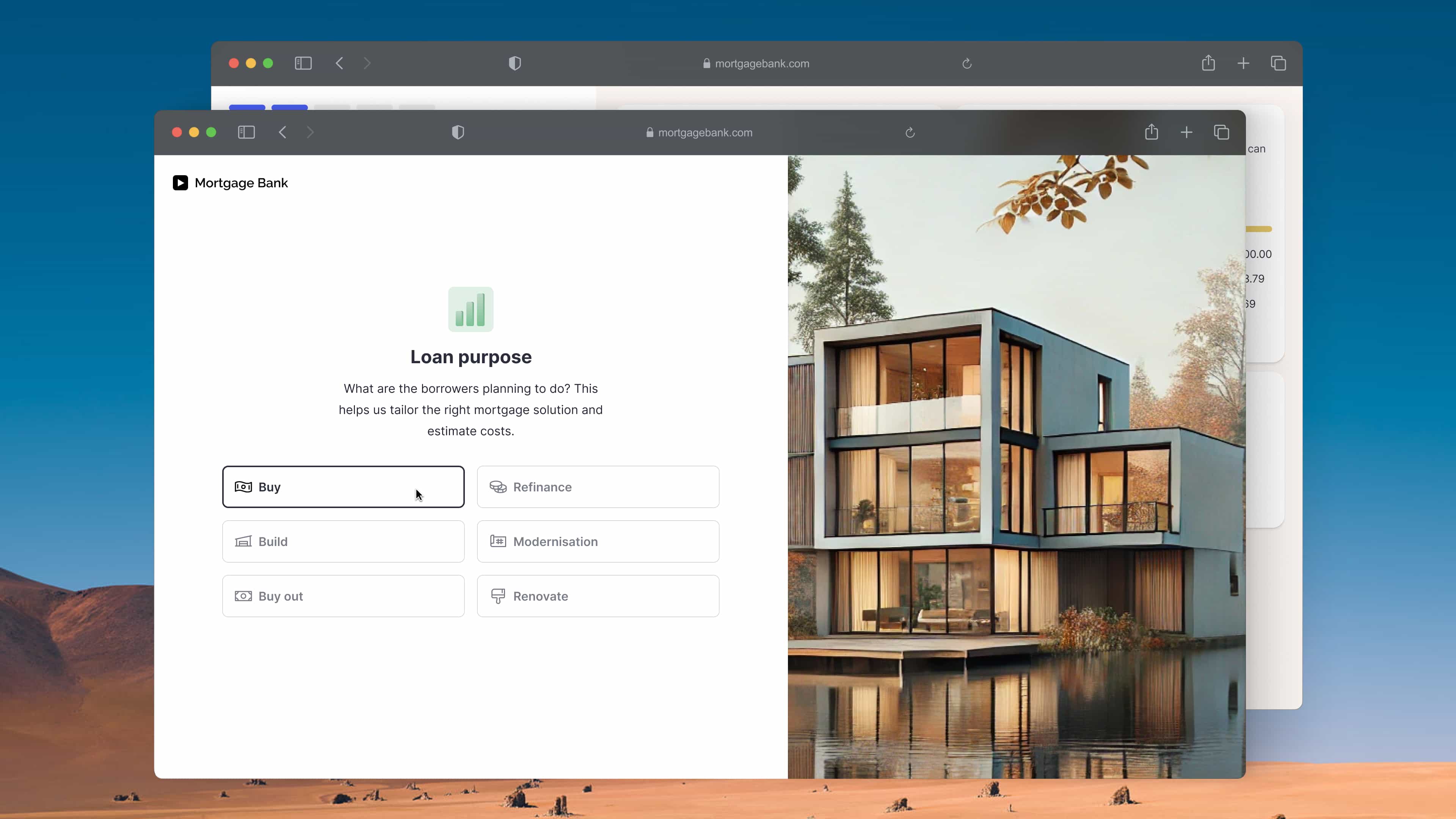
The Simulator was introduced as a standout feature—designed to help advisors and brokers quickly simulate mortgage scenarios and recommend the most suitable products based on a borrower’s unique financial situation.
In theory, it was meant to streamline decision-making and reduce friction in the mortgage process. But in practice, the tool wasn’t delivering on its promise. Despite being positioned as critical, it was rarely used—signaling a deeper disconnect between its design and the real needs of the people it was built for.
Problem
While the Simulator was positioned as a key feature of the platform—marketed as a powerful tool for advisors and brokers—it wasn’t being used. Banks were paying for it, but their teams avoided it entirely.
Why? Because the tool didn’t reflect their real-world use cases. It was complex, unintuitive, and out of sync with how advisors actually worked. Instead of saving time, it slowed them down. Despite its promise, the Simulator was too rigid, too hard to use, and not built with users in mind.
Internally, no deep user research had been done to validate how (or if) the feature met broker needs. It was launched as a highlight, but without testing or understanding its fit in real advisor workflows, adoption never took off.
Research
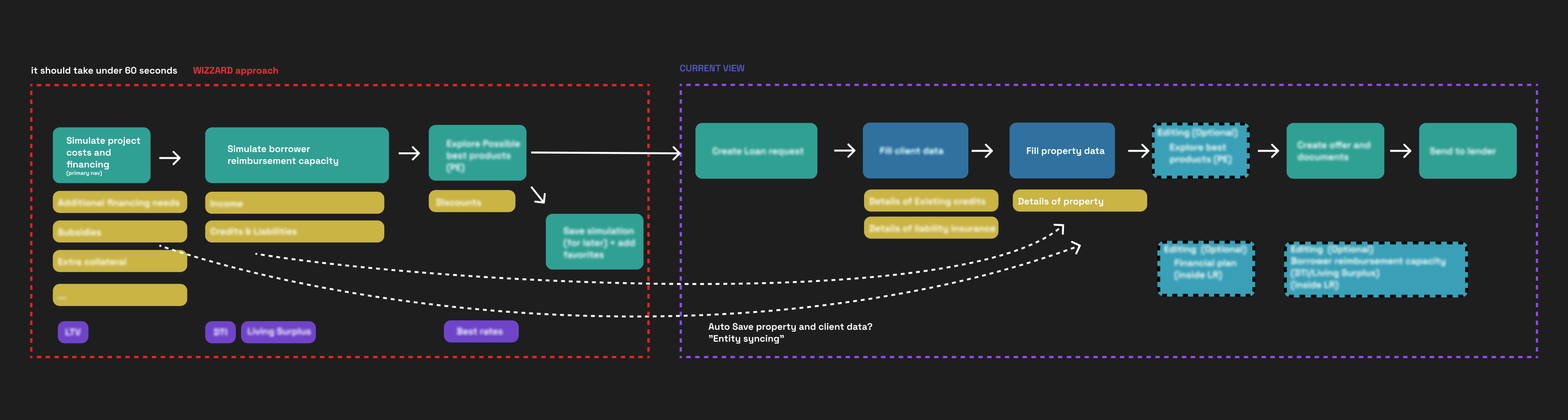
To understand why the Simulator wasn’t being used in practice, I started by digging into its architecture. Mapping out the system helped clarify how the feature was built and why certain decisions—like data input logic—were made. This also revealed early structural flaws, like an overload of mandatory fields that created unnecessary friction for users.
In parallel, I conducted one-on-one interviews with advisors and brokers to observe how they worked, what they needed from the tool, and where their current experience broke down. This qualitative research revealed critical disconnects between the tool’s design and real-world workflows.
Key Findings
Too Much Mandatory Input: Advisors were forced to enter excessive amounts of data to run even basic simulations—creating friction before they could see any value.
Slow, Time-Consuming Process: Simulations took 10–15 minutes on average, which didn’t align with the fast-paced nature of client-facing work.
Limited Personalization: Mortgage products weren’t tailored to borrowers’ specific needs, making the results feel generic and less trustworthy.
Overly Technical Output: The simulation results were hard to interpret—and even harder to explain to clients—due to complex and jargon-heavy presentation.
No Easy Way to Share Results: Advisors couldn’t directly share simulation outputs with borrowers, breaking the collaboration flow.
Lack of Workflow Integration: Even when a simulation led to agreement, advisors had to manually recreate everything in the Loan Request process—adding redundant steps and frustration.
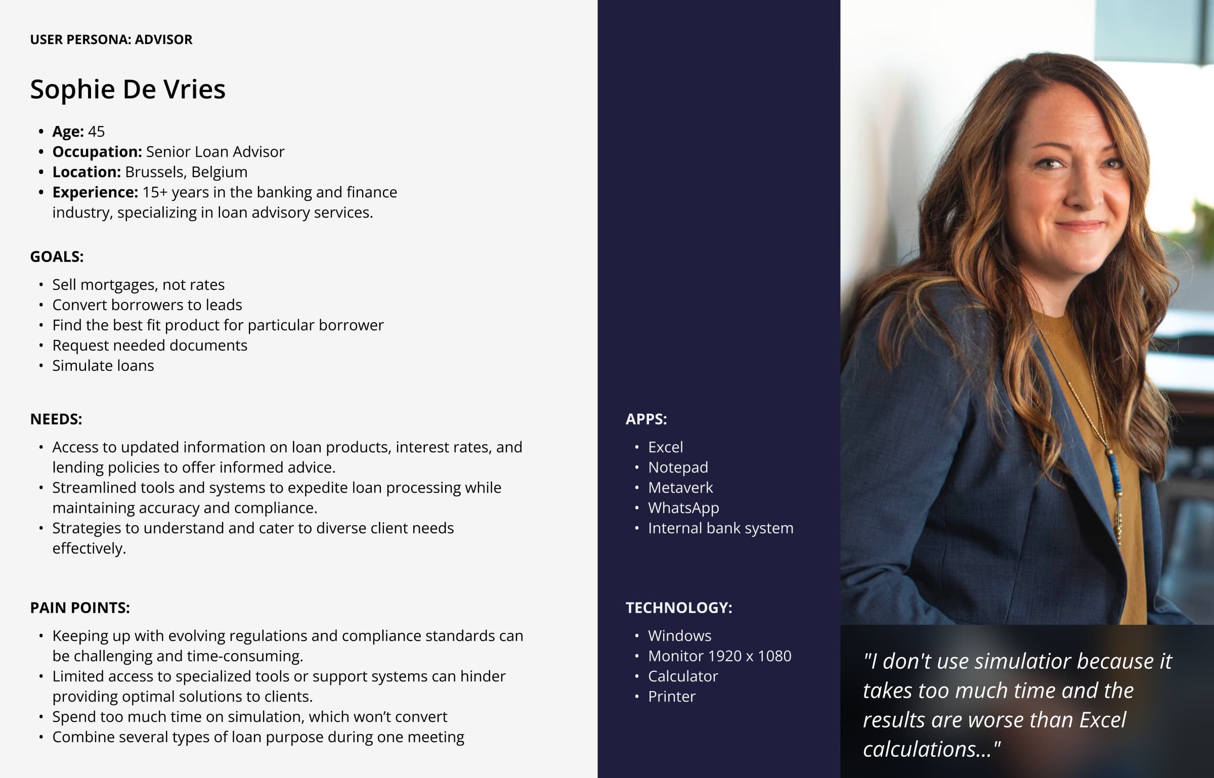
User persona Insights
At first glance, all advisors seemed to share a common goal: helping banks sell mortgages. But deeper user research revealed a more nuanced reality—advisors had different workflows, tools, and priorities depending on their role and context.
Creating personas helped capture this diversity and gave the team a clear lens through which to design. One persona, in particular, became central to the redesign:
Core Traits: Prioritized speed and simplicity. Often worked over the phone or in face-to-face meetings, requiring fast access to information with minimal clicks or inputs.
Key Motivations: Needed quick, reliable simulations to support real-time decision-making with borrowers—no time for long forms or complex data entry.
This persona grounded the design direction, helping us define what “efficiency” really meant in practice and ensuring the Simulator worked for advisors under real-world pressure—not just in theory.
User tasks
Through journey mapping and workflow analysis, I identified key tasks that advisors regularly perform when working with clients. Addressing these tasks was essential to making the Simulator feel truly useful in day-to-day operations.
1. Quick Simulations: Running simulations in real time—often during live calls or in-person meetings—to help borrowers make fast, informed decisions.
2. Loan Consolidation: Handling scenarios where borrowers combine multiple loans or assets to reduce their loan-to-value (LTV) ratio and unlock better mortgage options.
3. Debt-to-Income Ratio (DTI): Assessing borrowers’ DTI ratios to determine eligibility and align with lender product constraints.
These real-world tasks helped shape design priorities—ensuring financial logic, usability, and speed were at the core of the experience.
Feature Structure
Building on research insights and advisor interviews, I created a feature map outlining the key user flows to support in the high-fidelity prototype. These six task streams became the backbone of the redesigned Simulator:
1. Adding Loan Details – Capture the core financial data for accurate simulation results.
2. Providing Borrower Details – Personalize the simulation by gathering relevant borrower info.
3. Filtering and Selecting the Best-Fit Product – Enable advisors to compare and choose the best-fit mortgage options based on borrower context.
4. Printing and Sharing Simulations – Give advisors an easy way to present results to clients—clearly and professionally.
5. Creating Proposals – Package selected simulations into formal proposals with just a few clicks.
6. Convert to Loan Request – Seamlessly transition from simulation to loan request, eliminating redundant manual work.
This structure, grounded in real user needs, guided the prototype development and ensured the tool supported the complete advisor workflow—from quick estimates to formal loan submissions.
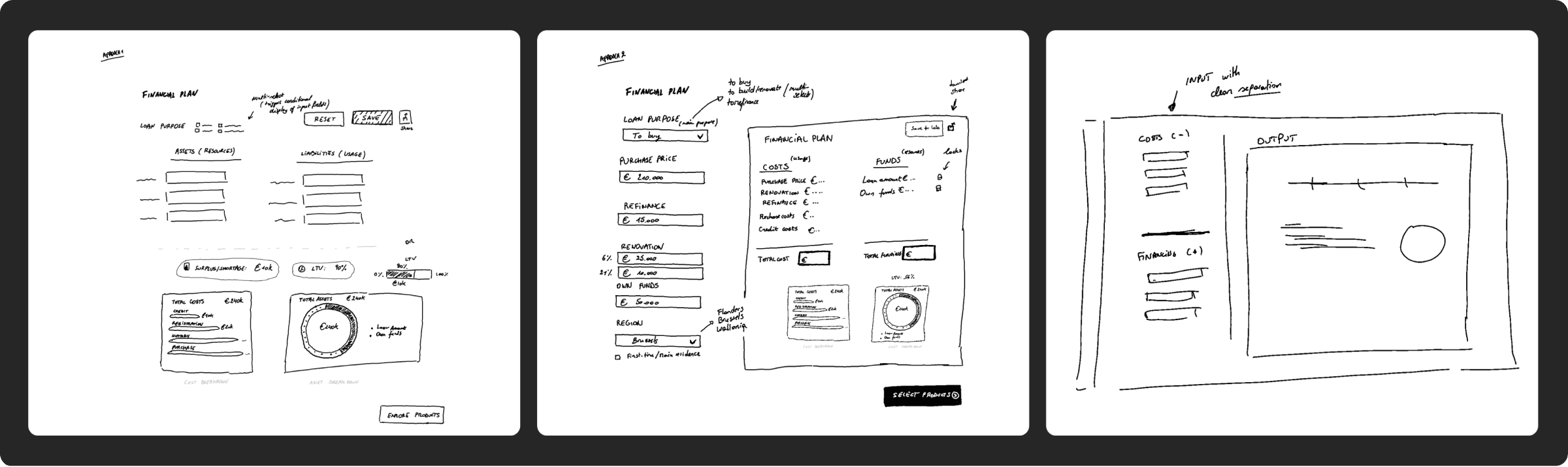
Sketching & Idea Validation
To kick off the redesign, I used rapid sketching to explore multiple ideas and test early assumptions. Collaborating closely with internal stakeholders and client teams, we iterated quickly—gathering feedback, validating direction, and aligning on the core structure of the simulation flow.
Key outcomes from this phase:
Identified flexible screen types that could handle multiple tasks—like loan consolidation and discount applications—within a streamlined layout.
Validated workflows that simplified complex actions without compromising depth or accuracy.
This early phase of sketching and collaborative critique helped us lock in design principles that were both intuitive and rooted in real use cases.
From Lo-Fi to Hi-Fi
With low-fidelity prototypes, we tested the core interactions and flows. Watching how users navigated the experience in real time—and hearing them describe their expectations—revealed key friction points and areas for refinement.
These insights directly informed the high-fidelity prototype, which introduced more polished features designed to improve clarity, guidance, and control.
Highlighted features in the high-fidelity prototype:
• Visualization Tools – Clearer data presentation to help users interpret simulation results quickly.
• Contextual Tooltips – Built-in guidance to reduce onboarding time and eliminate guesswork.
• LTV Slider – An interactive component for adjusting loan-to-value ratios in real time—making it easier to explore scenarios without re-entering data.
New Challenges
While the high-fidelity prototype successfully guided users through simulations, real testing surfaced unexpected friction points. These weren’t blockers—but they uncovered deeper needs and edge cases that hadn’t been addressed earlier in the flow.
These challenges provided valuable insights for further refinements:
1. Unfamiliar Terms: Users were confused by terms like “green mortgage” and needed contextual explanations to move forward confidently.
2. Multiple Borrowers: Many advisors needed to simulate scenarios involving two borrowers—something the current version couldn’t support.
3. Returning Borrowers: Questions came up about how to handle cases where borrowers return months later—especially regarding saved data and proposal continuity.
4. No Product Match: Advisors struggled with “dead-end” simulations when no product matched the borrower’s profile, leaving them unsure how to proceed.
5.Comparing Options: A new pattern emerged: advisors wanted to compare several mortgage products side-by-side for one or more borrowers, especially in client-facing conversations.
Considerations for Long-Term Development
Based on the feedback, we outlined several improvements to support real advisor workflows and scale the Simulator’s capabilities over time:
1. Flexible Entry Points: Allow simulations to start from multiple places—like an in-app widget, CRM, or landing page—to better fit into varied workflows.
2. Side-by-Side Product Comparison: Let advisors compare different mortgage products in one view—making discussions with clients faster and more transparent.
3.Support for Multiple Properties: Enable simulations involving more than one property in a single analysis—especially useful for investment borrowers.
4. Advanced Configuration Options: Introduce detailed settings for experienced users who need more control over simulation parameters.
5. Customized Simulation PDFs: Allow advisors to personalize downloadable PDFs with their branding or borrower-specific details.
6. Note Collection & Sharing: Automatically capture meeting notes and allow them to be shared with borrowers—helping maintain context over time.
Lessons Learned
Talk to users early—and often:
Engaging customers at the start and validating assumptions through conversations and quick tests helped us avoid wasting time on ideas that didn’t hold up.Function over polish during beta:
In early releases, delivering core functionality matters more than perfect UI. Usability can be refined, but the product has to work first.Real value > clever features:
Users care most about solving real problems. Before adding layers of delight or aesthetic refinement, make sure what you’re building is actually useful.Tackle complexity early:
Identifying complicated components or interactions upfront helps reduce the risk of late-stage surprises and keeps delivery on track.Collaborate closely—or risk inefficiency:
Frequent, direct communication with PMs, designers, and QA reduced misalignment and helped us avoid “GitLab ping-pong” cycles of back-and-forth fixes.Break work into smaller wins:
Splitting big tasks into manageable pieces kept momentum steady and allowed for quicker iteration across design and dev.Encourage proactive dev communication:
When developers feel comfortable raising potential implementation issues early, it creates a healthier feedback loop—and prevents small concerns from turning into blockers.