
A powerful tool that nearly lost users at hello.
Collectif.ai is my startup, an AI-powered tool that transforms qualitative data from sources like support tickets and interviews into actionable insights. By automating analysis and uncovering sentiment trends, it helps teams enhance user experiences, prioritize product roadmaps, and address usability issues -making product development smarter and faster
Roles
Lead Product Designer
UX Researcher
Interaction (IxD) Designer
User Interface (UI) Designer
Deliverables
User Behavior Analysis
Qualitative Research Insights
Interview Insights
Onboarding Flow Redesign
Low-Fidelity Prototypes
High-Fidelity Prototype
Design Testing & Validation
Future Onboarding Recommendations
Project Specifications
Figma
Maze (research tool)
TL;DR
I was brought in to fix a surprising problem: users were excited to try Collectif - but many dropped off during onboarding. Even high-intent users skipped key steps, leaving without seeing the product’s real value.
I led the redesign of the onboarding experience, using a mix of user interviews, behavioral data, and feedback processed through Collectif itself. The result was a simpler, clearer, and more confidence-building first experience—one that helped users get value from day one.
Key highlights:
Overview
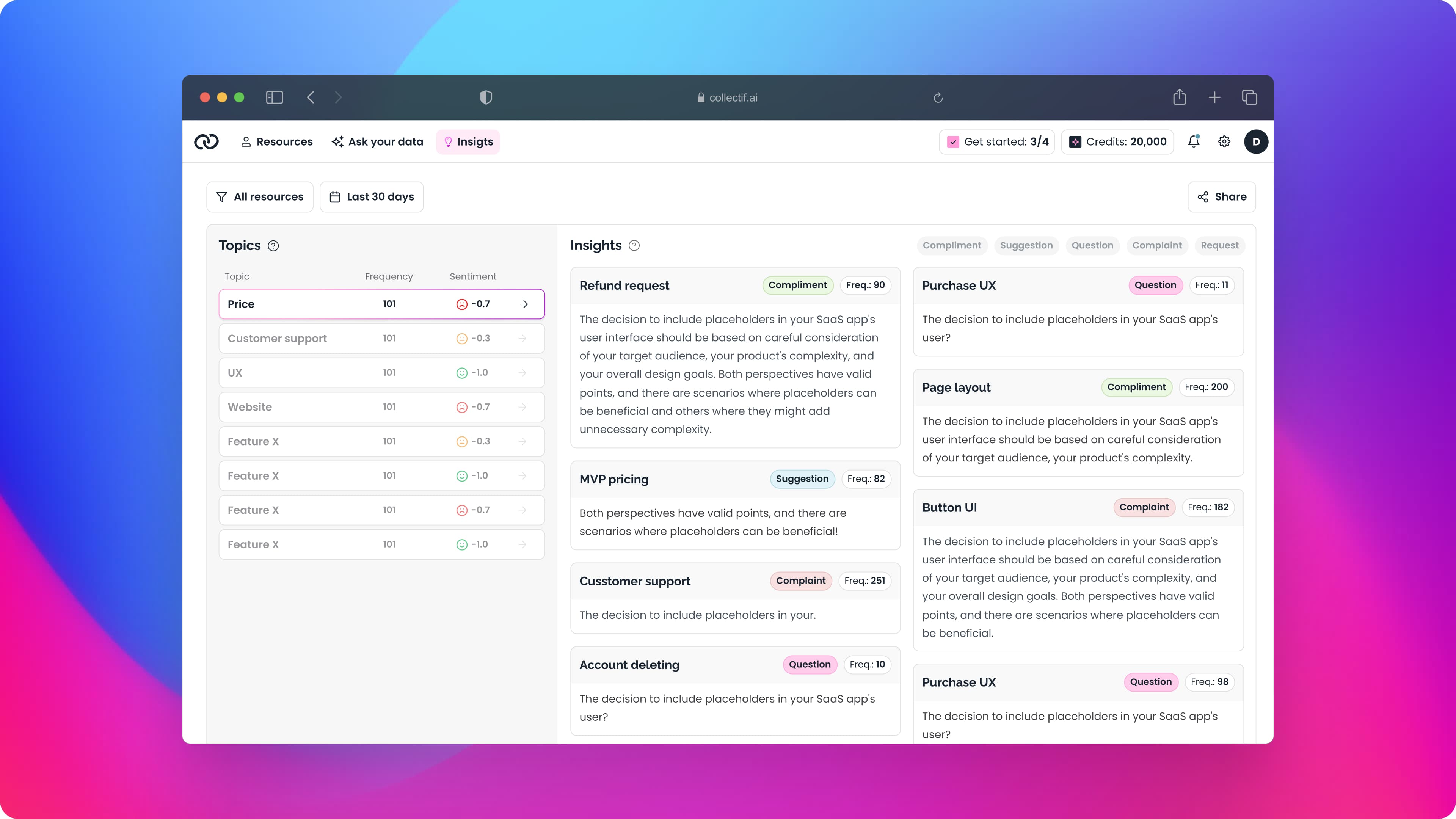
Collectif.ai is an AI-driven SaaS tool that simplifies continuous discovery by automating qualitative data analysis. It collects and analyzes user feedback from sources like support tickets, interviews, surveys, and reviews, offering actionable insights and sentiment analysis. This empowers product teams to prioritize roadmaps, identify usability issues, and create user-focused products.
By embedding feedback into the research flow, Collectif enables teams to make decisions rooted in real user experiences, reinforcing adaptability and establishing a reliable foundation for product development.
Problem
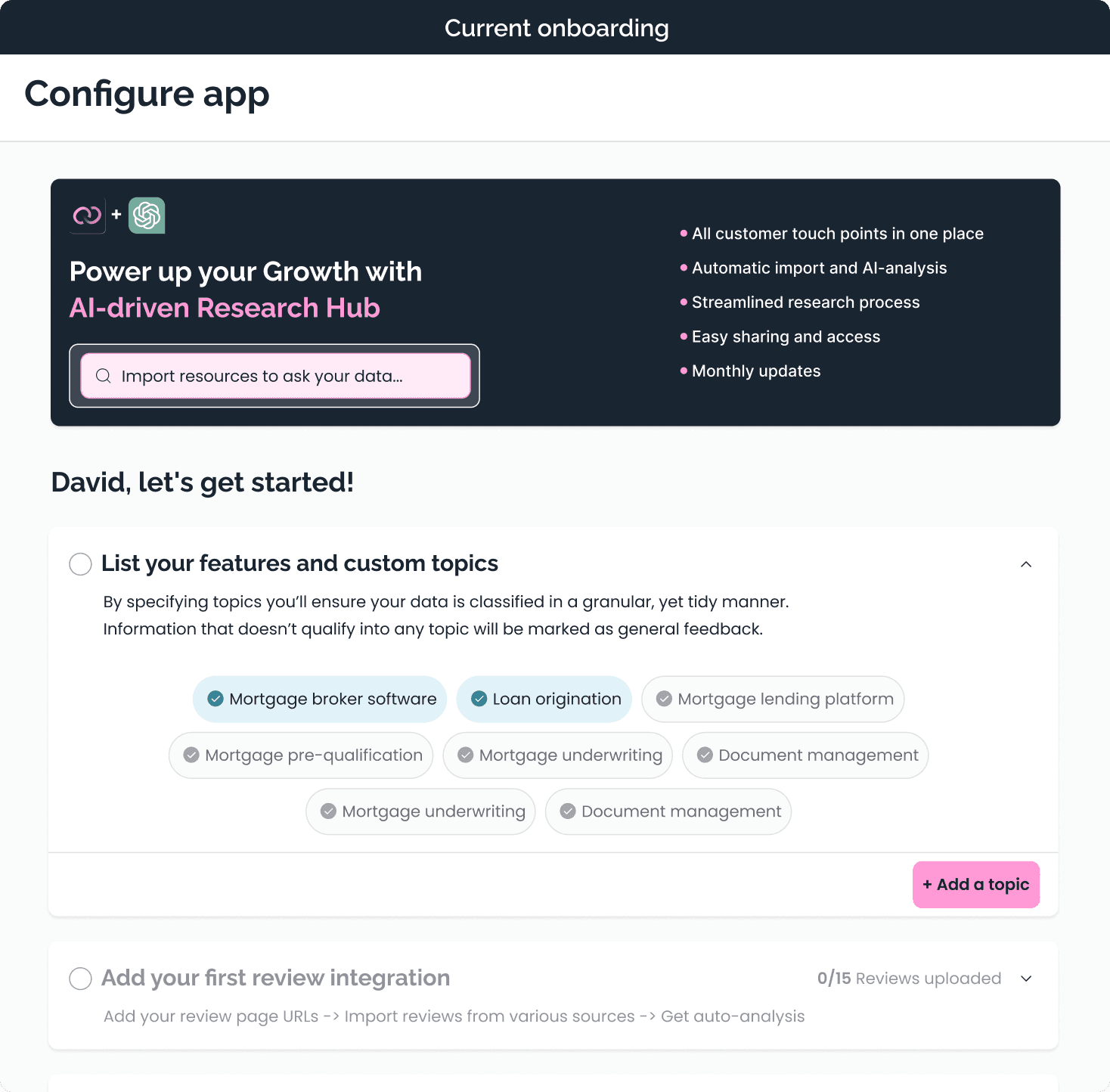
Shortly after launching Collectif, we monitored user behavior through data funnels and Hotjar recordings. Conversions dropped significantly during the onboarding phase. Users with high initial motivation—especially those eager to explore the demo account—often skipped onboarding or failed to set up any applications.
Our initial hypothesis suggested that the onboarding process might be overly complex, creating friction for new users.
Research
To investigate, I analyzed Mixpanel event data to understand user behavior across funnels. This was followed by reviewing Hotjar recordings, which revealed usability gaps and functionality issues in the onboarding process.
To gain deeper insights, I conducted one-on-one interviews with users. Observing how they navigated the system during onboarding helped uncover their pain points and specific challenges.
Interestingly, the feedback from these interviews was processed and analyzed using Collectif itself, validating the tool’s ability to uncover meaningful insights from qualitative data.
Research findings
Through user testing and feedback, several key issues were identified during onboarding:
Unclear Terminology: Users struggled to understand the naming and purpose of the “Topics” section.
Complex Interface: The UI was perceived as overly complicated, making navigation difficult.
Distracting Exit Points: Users were frequently distracted by multiple ways to leave the onboarding process.
Feature Confusion: The “Analyze Reviews” feature caused confusion, especially for users who only intended to import “Interviews.”
Lack of Guidance: Users felt unsure about what to do next after completing steps, leading to frustration.
Overwhelm: The onboarding process became overwhelming, causing many users to abandon the flow.
Competitive Analysis
To address these challenges, I conducted a competitive analysis, comparing Collectif with similar AI research tools.
Key insights included:
Simpler, Linear Onboarding: Competitors offer straightforward onboarding flows, delivering information in smaller, digestible steps.
Mandatory Completion: Competitors require users to complete the onboarding process, preventing premature exits.
Generalized Terminology:
Simplified naming conventions make features easier to understand.Reduced Complexity:
Unlike Collectif, competitors minimize time-consuming integrations during onboarding, allowing users to get started faster.
These findings highlighted opportunities to simplify Collectif’s onboarding while ensuring it remains informative and user-friendly.
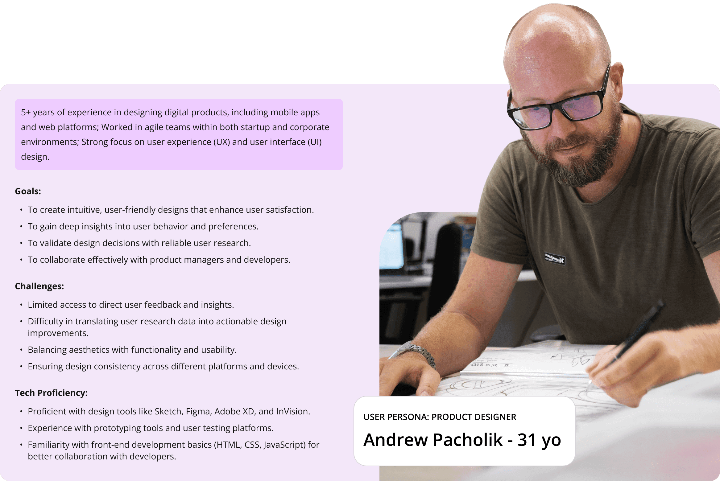
Deepening User Empathy
Armed with research findings and competitive insights, I focused on understanding user motivations and behaviors more deeply.
To do this, I conducted in-depth interviews with existing users to uncover their reasons for completing or abandoning onboarding. The goal was to gain insight into when and how they discovered Collectif and what drove their decisions.
These interviews provided valuable context, enabling me to create a user persona tailored to this specific case. This persona reflected the motivations, needs, and frustrations of Collectif’s target audience, ensuring design improvements addressed real user challenges effectively.
Ideation
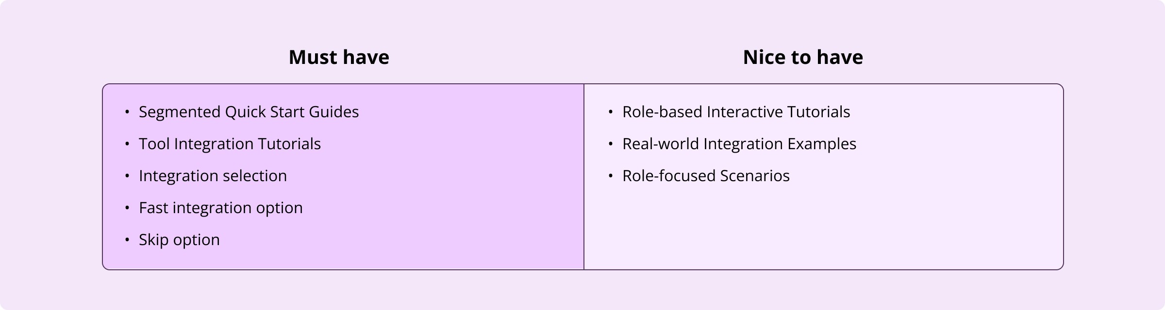
With a clear understanding of user needs, I began brainstorming features essential for improving Collectif’s onboarding experience. My focus was on identifying “Must Haves”—features that were feasible, impactful, and could be designed within the project’s timeframe.
Structure
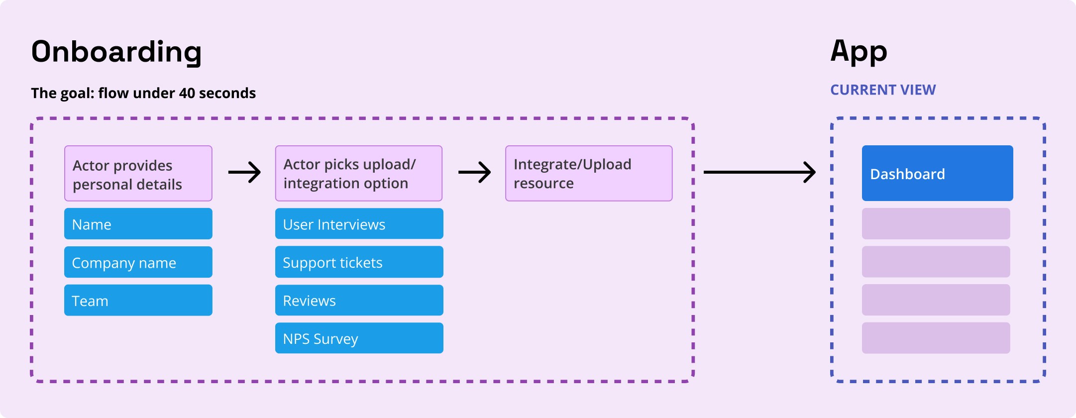
To establish a strong foundation for the onboarding flow, I collaborated with my team using insights from surveys, interviews, and feature prioritization workshops. Together, we outlined a framework focusing on three critical steps in the high-fidelity prototype:
1. Personal Details: Collecting essential user information to tailor the experience.
2. Analyze Selection: Guiding users to choose the analysis type most relevant to their needs.
3. Integration/Upload: Simplifying the process of connecting data sources or uploading files.
This structure was informed by user research and served as the guiding principle for future design iterations.
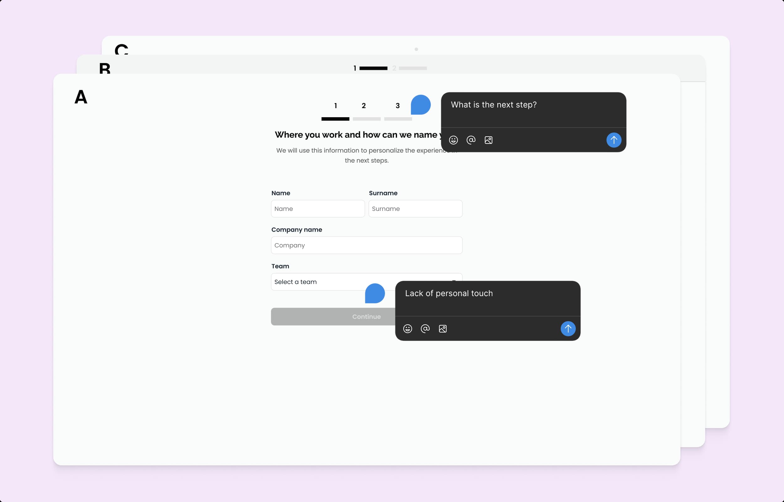
Lo-Fi Wireframes
I began by creating low-fidelity wireframes to visualize the new onboarding flow and test ideas for improving usability. Several “wizard” approaches were explored to ensure the process felt intuitive and efficient. After multiple iterations and user feedback, the final design featured:
A simplistic wizard with clear, step-by-step navigation.
Dynamic steps in the flow, adapting based on user selections in Step 2 (Analyze Selection).
Clear progress indicators to show users their current stage and what remains.
While alternative designs offered faster onboarding, they sacrificed critical information and disrupted the process’s linearity. The chosen approach balanced speed, clarity, and thorough data collection to ensure a user-friendly and complete onboarding experience.
Hi-Fidelity Prototype
Building on feedback from initial usability tests, I developed high-fidelity wireframes and a functional prototype. These refined designs integrated user insights to address usability issues while maintaining the simplicity and structure of the onboarding flow.
The high-fidelity prototype allowed users to:
Experience a visually polished and intuitive design.
Navigate the onboarding process seamlessly, with fewer distractions and clearer guidance.
Complete onboarding efficiently without sacrificing the depth of required information.
This stage confirmed that the design choices aligned with user needs and ensured the onboarding process delivered value to both users and the product team.

Considerations for Long-Term Development
Revisiting the login and onboarding experience on a micro level will be a key focus for future iterations. To improve user engagement and clarity, the following areas will be prioritized:
Clarity and Consistency:
Refine how actions are named, described, and presented throughout the application.
Use clear, concise wording to address potential user hesitation during early interactions.
Onboarding Enhancements:
Provide a clearer purpose for onboarding, helping users understand its value.
Explore gamification elements to make onboarding more engaging.
Consider offering optional onboarding for returning or experienced users.
Investigate integrating onboarding within the main application for a seamless experience.
Lessons Learned
First Impressions Matter:
The initial interaction with the application is critical. It must be simple, engaging, and highlight the most important features.Timely Information Delivery:
Presenting the right information at the right time keeps users focused and reduces cognitive overload.Setup Challenges:
Even if users show interest during a demo, a complicated setup process can discourage them from fully adopting the app.User and Competitive Insights:
Analyzing competition and understanding user personas are invaluable for refining the user experience and meeting expectations.
These lessons reinforce the importance of designing with the user in mind, ensuring every step of the experience is intuitive and engaging.

