Complexity to Conversion
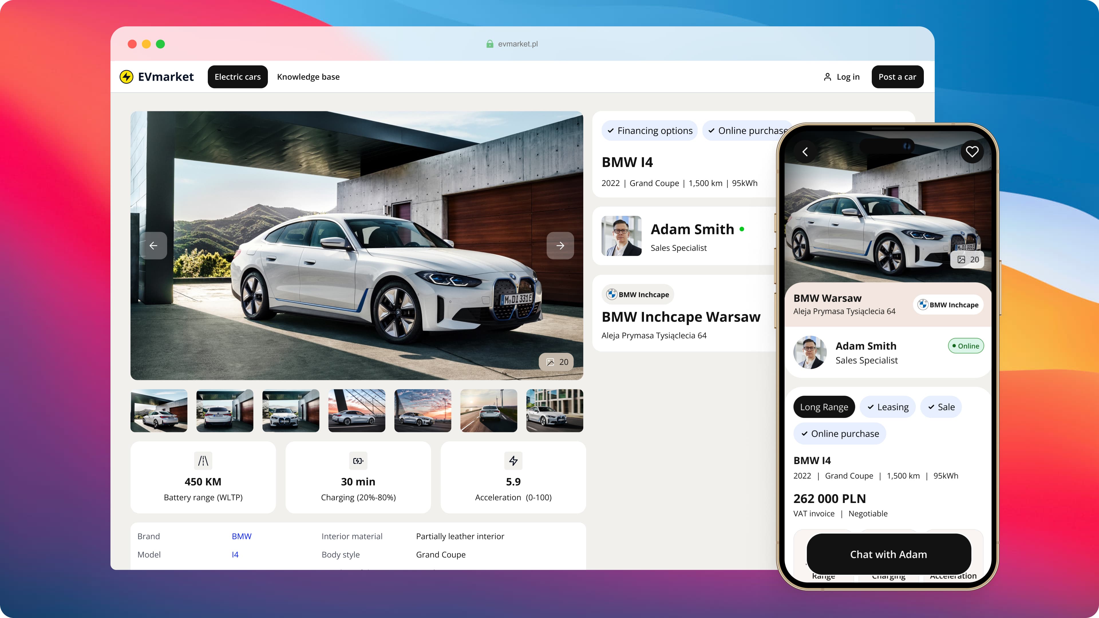
EV Market is a unique service in Poland dedicated to enhancing the experience for electric car buyers. Its goal is to simplify the process of buying and selling electric vehicles, making the transition to EVs easier for everyone.
Roles
Lead Product Designer
UX Researcher
Interaction (IxD) Designer
User Interface (UI) Designer
Deliverables
User Behavior Analysis
Qualitative Research Insights
Persona Refinement
User Journey Redesign
Content & Terminology Updates
Mid-Fidelity Wireframes & Design Iterations
New Design System components
Project Specifications
Figma
Maze (research tool)
TL;DR
I was tasked with improving conversion on an EV marketplace where users were dropping off early - often before even viewing detailed car profiles. Through behavior analysis and user interviews, I discovered that many potential buyers felt overwhelmed by jargon and lacked basic knowledge about electric vehicles.
I led a full redesign of the key user flows, focusing on clarity, confidence, and simplicity. By restructuring the experience around first-time users—not just EV experts—I helped make the product more approachable, better understood, and more likely to convert.
Key highlights:
Overview
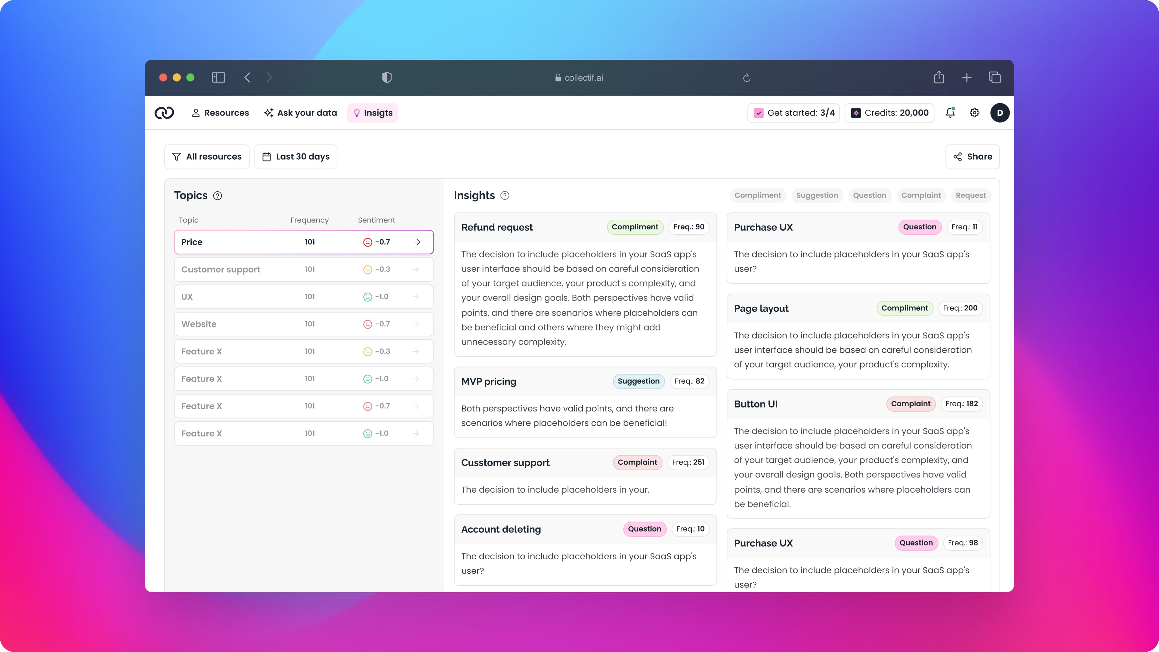
EV Market is currently facing a low conversion rate in key areas of the app, including the car feed and car profiles. While this could be influenced by factors such as car pricing or users who browse without plans to buy, user feedback suggests there may be another issue contributing to the problem. This feedback is explored in more detail below.
Problem
The EV Market app was originally designed with advanced users in mind, assuming that buyers and sellers already had a basic understanding of electric vehicles. However, it became clear that many potential users feel uncertain and lack knowledge about EVs. They often struggle with technical jargon and find the information too complex to navigate.
Key concerns from users include questions about battery life, charging availability, and overall cost. This confusion and lack of accessible information make users hesitant to engage with the app or trust its content.
As a result, conversion rates have declined, and app usage has dropped, highlighting the need for a simpler and more educational approach to help users feel confident about electric vehicles.
Research
To better understand the challenges and motivations of EV buyers, I began by exploring forums where users discuss electric vehicle purchases. This helped me identify common questions and concerns about EVs.
Next, I conducted in-depth interviews with five electric vehicle owners. These interviews provided insights into their decision-making process, including how they chose their car, the factors they considered important, and why they opted for an EV over a traditional vehicle.
Research findings
Many users prioritize reducing emissions and supporting sustainability.
Long-term savings on fuel and maintenance are key motivators.
Advanced features and smart functionalities are highly valued.
Users appreciate smooth acceleration and quiet operation.
Improved battery technology and charging infrastructure reduce range anxiety.
rust in reputable manufacturers significantly influences purchasing decisions.
FAQ findings
Through research, I identified the most common questions potential EV buyers ask:
How far can electric cars travel?
Are there public charging stations nearby?
How long does it take to charge an EV?
What type of EV charging connection do I have?
What does an EV cost to own?
What happens when an EV runs out of power?
How does temperature affect EV range?
These questions highlight the practical concerns and uncertainties users face when considering an electric vehicle.
Understanding User Needs
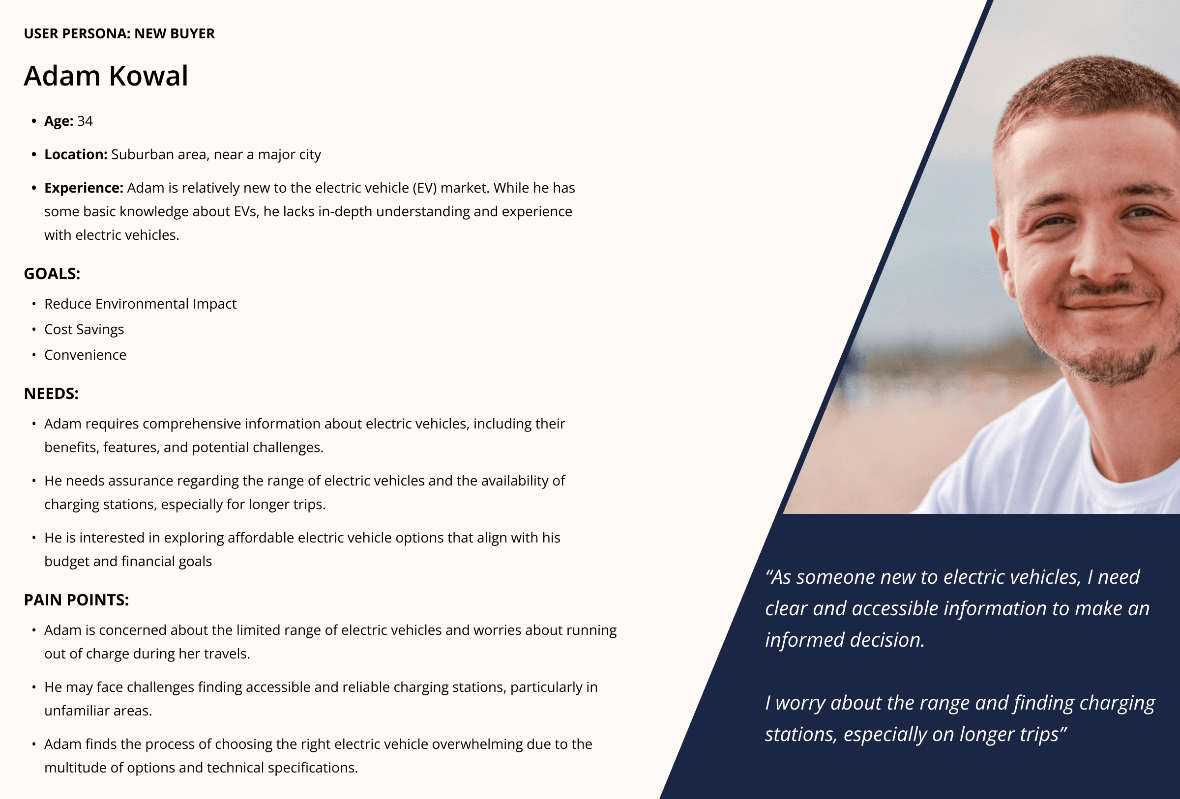
To align design decisions with real user challenges, I developed personas that represent target audiences. One example is Adam Kowal, a 34-year-old living in a suburban area near a major city. Adam is new to the electric vehicle market. While he has some basic knowledge, he lacks detailed understanding and firsthand experience with EVs.
Adam’s persona helps capture the needs of users who feel interested but hesitant, allowing me to design solutions that address their concerns and build their confidence.
Mapping the User Journey
By creating a journey map, I explored the emotional and practical aspects of purchasing an electric vehicle. This process revealed that adopting new technology like EVs can cause significant anxiety. How information is presented and how pathways are designed can determine whether users proceed with their purchase or choose to stay with gasoline vehicles.
The journey map focuses on Adam’s experience, covering these key stages:
Considering: Initial curiosity mixed with doubts about practicality.
Exploring: Actively researching EVs, comparing features, and seeking reassurance.
Doing: Taking actionable steps like test drives or visiting dealerships.
Testing: Evaluating the EV’s suitability for daily life.
Negotiating: Deciding on price, terms, and incentives.
Promoting: Becoming a satisfied owner and advocating for EVs to others.
This map provides a structured framework to identify pain points and opportunities for improvement at every stage.

Ideation and Feature Prioritization
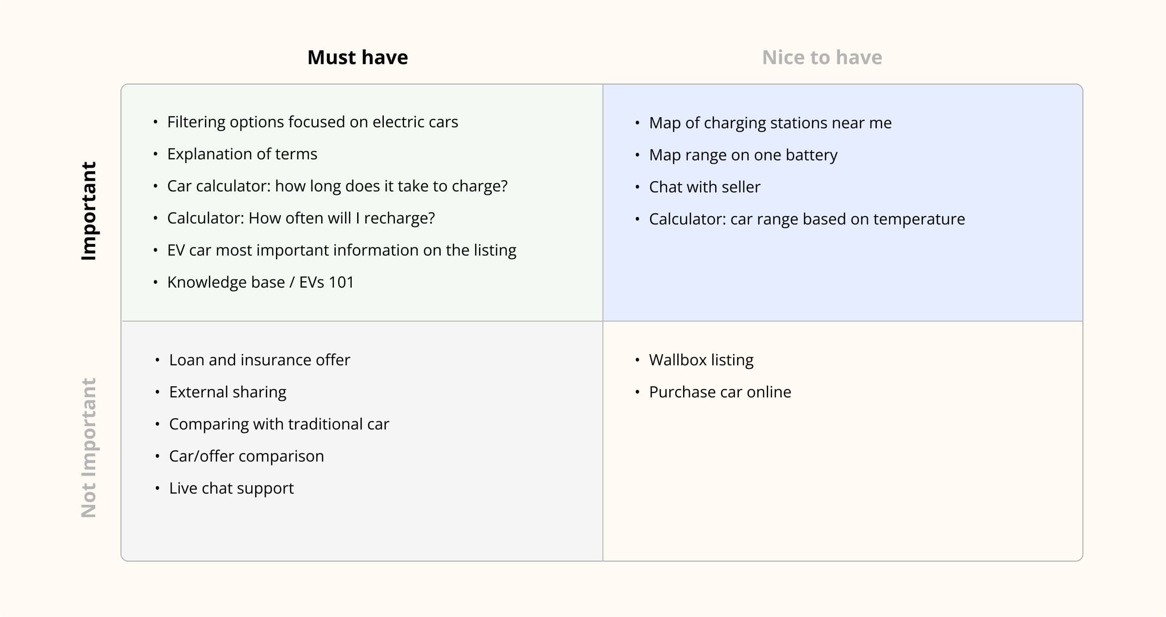
With a clear understanding of the solutions that would provide the most value to users, I began brainstorming app features using the Eisenhower Matrix. My goal was to create an app that is easy to use, transparent, and educational. The interface needed to cater to new buyers by presenting information in an intuitive and accessible way.
Using the Eisenhower Matrix, I categorized features based on their importance and urgency:
Must Have:
• Filtering options specifically for electric cars
• Explanations of EV-related terms
• Various calculators (e.g., cost, range, and savings)
• A comprehensive knowledge base to address common concerns
Nice to Have:
• Charging station map
• Chat functionality to connect buyers and sellers
• Temperature-based range calculators
Features deemed less critical or urgent were deprioritized, ensuring the app remained focused and functional for its primary users.
User Interaction Insights
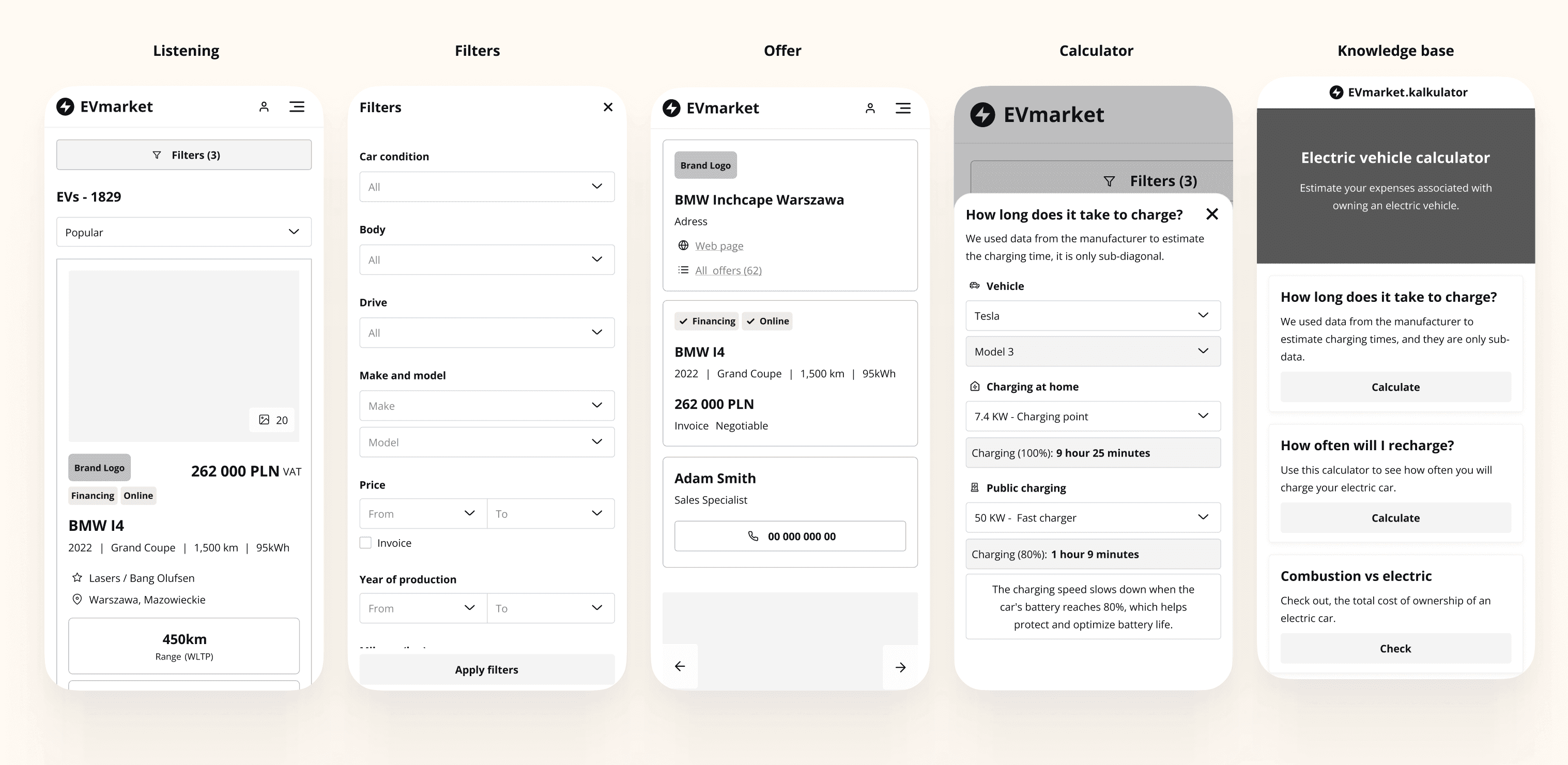
Testing the low-fidelity prototype provided valuable insights into user expectations and pain points. Observing user behavior and engaging them in discussions about their interactions helped refine the app design.
Key feedback and findings included:
Pain Points:
• The car profile page felt confusing and lacked clarity.
• Dealer cards were considered intrusive and distracting.
• The listing page appeared cluttered and overwhelming.
• Closing the filter menu was unintuitive and frustrating.
Positive Feedback:
• The calculator on the car profile page was highly appreciated, helping users understand costs and benefits.
• The calculators acted as an engaging feature, influencing user decisions positively.
This feedback guided the development of a more refined high-fidelity prototype, ensuring the app met user needs while addressing their concerns.
High-Fidelity Testing
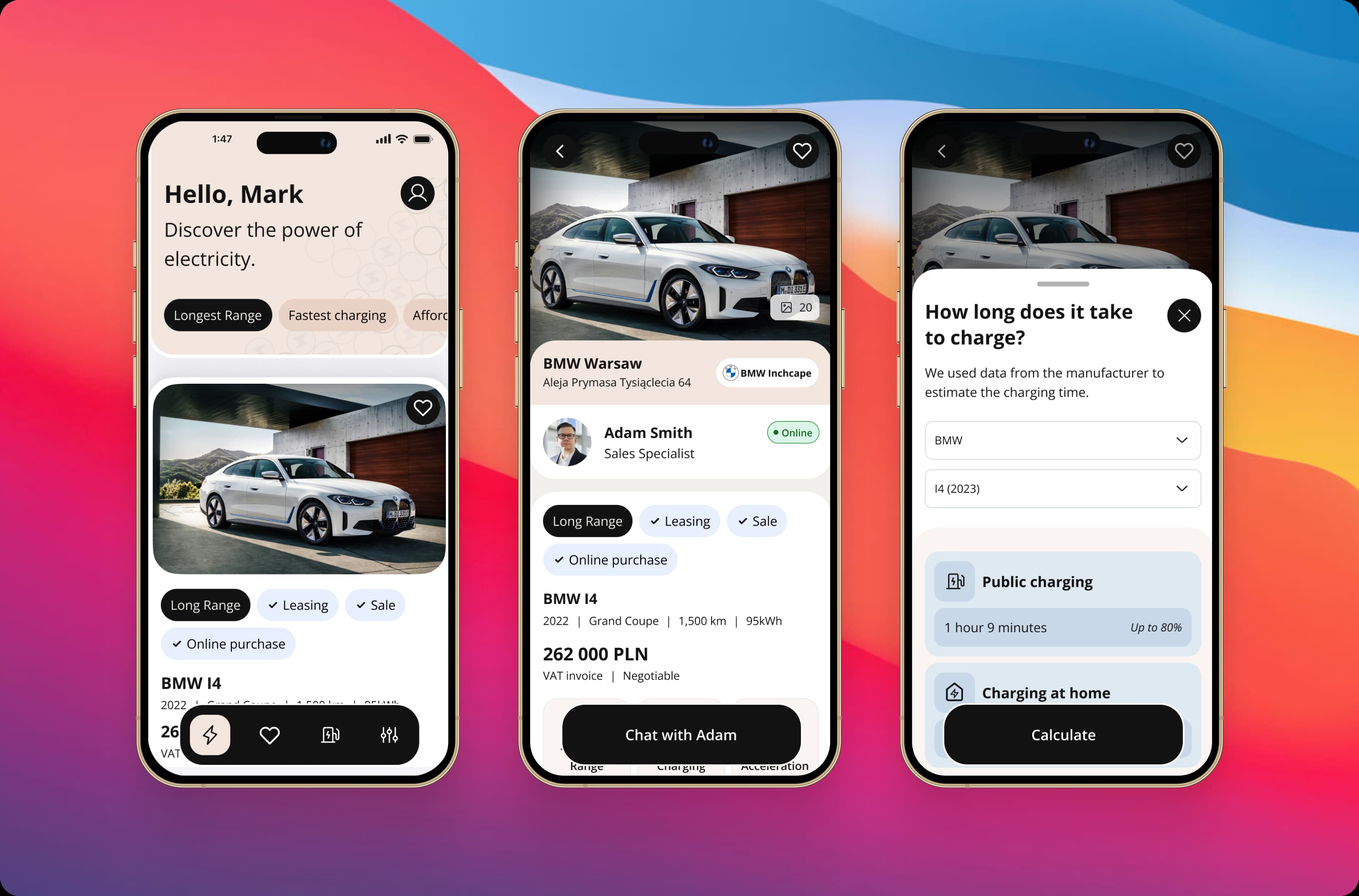
Building on feedback from the low-fidelity testing phase, I developed a high-fidelity prototype to create a more realistic user experience. This enhanced prototype allowed users to interact with a design closer to the final product, revealing new insights and challenges.
Key Findings:
• Users appreciated the improved access to detailed information about electric vehicles and available offers.
• Some users expressed confusion about processes such as securing a loan for a used car or understanding how government subsidies would apply to their purchase.
• A new need emerged: users wanted help selecting the right electric vehicle based on their unique requirements and preferences.
These insights helped refine the app further and informed the direction for long-term feature development.
Considerations for Long-Term Development
Based on user feedback and identified needs, I outlined several features for future development to enhance user experience and improve adoption:
Loan and Leasing Integration:
Enable users to apply for loans or leasing directly from the offer page, simplifying the process and saving time.Government Subsidy Filters:
Add filters that allow users to sort and explore offers based on available government subsidies, making it easier to identify cost-saving opportunities.Assisted Vehicle Selection:
Implement an optional survey tool to guide users in finding the most suitable electric vehicle based on their needs, preferences, and budget.Educational Content:
Produce articles or videos about electric vehicles to educate users, build trust, and establish the platform as a reliable resource for EV-related information.Charging Station Map:
Develop a map feature displaying nearby charging stations, helping users locate infrastructure conveniently and plan their journeys effectively.
Lessons Learned
Addressing the Trust Gap:
A major challenge in the EV market is the lack of trust and confidence among potential buyers. To overcome this, it’s essential to provide clear, reliable information and tools that guide users in their decision-making.Guided Assistance Matters:
When dealing with high-cost purchases, users appreciate personalized assistance. Features like surveys or recommendation tools can make the buying process easier and more reassuring.Highlighting Key Priorities:
Most users value economy and environmental benefits when considering EVs. Focusing on these aspects within the app can better align with user needs and motivations.Effective Feature Prioritization:
Using prioritization frameworks like the Eisenhower Matrix ensures that critical features are developed first, improving user satisfaction and overall engagement with the app.Prototyping Insights:
Low-fidelity prototypes are great for setting the initial direction, but high-fidelity prototypes are vital for uncovering deeper insights and refining the product. This stage provides a clearer view of user behaviors and needs.
