Oper Credits
Key highlights:
Overview
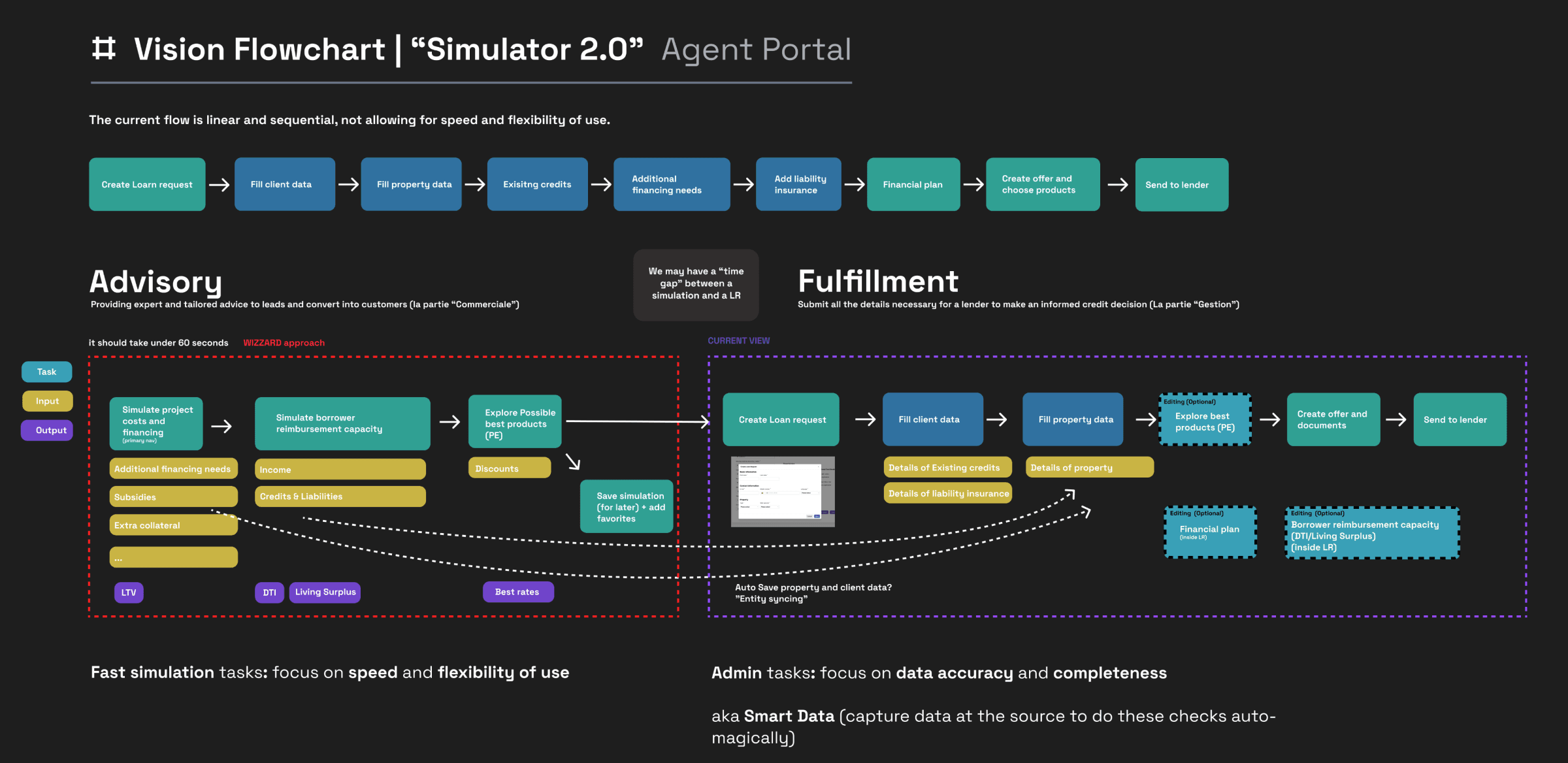
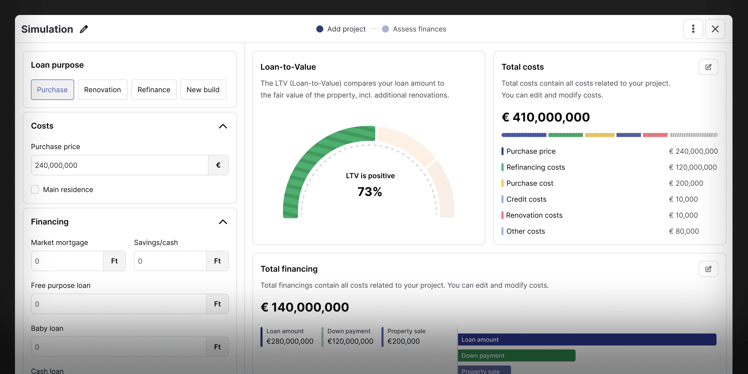
One of Oper’s main features is Simulator. The Simulator enables customers to swiftly and accurately simulate mortgage options. This functionality holds significant importance, as it allows advisors to gauge the viability of continuing the mortgage process with a borrower and to identify the most suitable product for their situation.
Problem
Brokers need to get quick understandings of financial strategies and estimations of project costs. They are expected to quickly search for products in order to lock the lowest possible rate in the market and a package for potential borrowers. It is crucial to understand that the best solution for a borrower does not necessarily correlate with the best rate. Instead, it is about providing the solution adapted to the specific position of the customer within a mortgage project. The added value of a broker is to look for or design the most suitable mortgage solution for the borrower in the given context and project.
Research
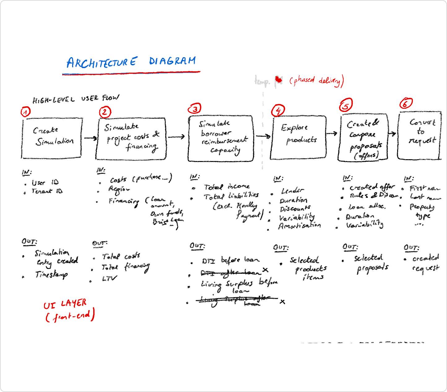
My initial research focused on understanding the architecture map, aiming to comprehend the current feature's construction and rationale. Simultaneously, the architecture map aided in organizing data mapping, distinguishing between mandatory and optional data necessary for presenting property rates. Additionally, one-on-one interviews were conducted to gain insights into users’ journeys and identify specific issues the app needed to address.
💡 Research findings
The current solution is not feasible since it entails mandatory data which makes it difficult for the advisors to quickly develop simulations.
The time taken per simulation created is on average 4 minutes.
There were no mortgage products tailored to meet the needs of the borrower.
The simulation result looks very technical.
Advisors do not possess the ability to pass on the simulation results to borrowers.
Even with borrower agreement, advisors cannot generate a "Loan request" from the created simulation.

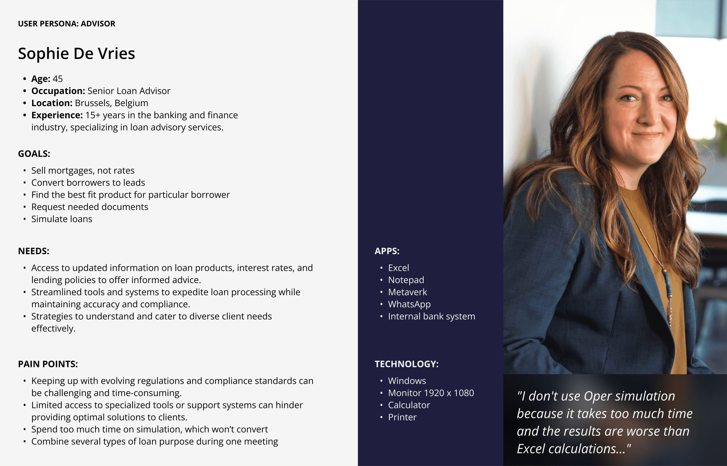
User persona Insights
At first glance, it might appear that all advisors share a common goal: The bank is involved in the sale of mortgages. But when we looked at it in a more detailed manner, with the help of user research, the motivations were quite different. The use of personas was particularly useful in helping to articulate these differences and became key references when defining functions. During the research and design process, my attention was directed to a specific persona.
This persona highlighted a strong emphasis on two key functions: using phone or face-to-face meetings for quick simulations for decision making.

User tasks
By developing and discussing journey maps and typical tasks, I identified the key procedural points that should be addressed by Oper.
For example, realizing that borrowers are capable of consolidating multiple loans or assets to reduce LTV or knowing that DTI affects the rate and some lender products.

Structure
The feature map, shaped by surveys and interviews, strategically outlines five key task streams that the high-fidelity prototype would emphasize:
1. Adding Loan Details
2. Providing Borrower Details
3. Filtering and Selecting the Best-Fit Product
4. Printing and Sharing Simulations
5. Creating Proposals
The framework presented by the site map, coupled with the amassed user insights, would serve as a guiding light for subsequent design decisions.
Sketching and idea validation
As a result of using rapid sketching, I was able to iterate and gain sign-off on design patterns with the internal team and clients. This process helped in achieving a good understanding of some of the aspects that were important in operating in Oper’s simulation flow.
Furthermore, it helped in defining screen types that would be able to perform several tasks at once, for example, to combine loans or offer a discount.

From Lo-Fi to Hi-Fi
Using low-fidelity prototypes for testing was extremely beneficial in understanding the expected tasks from the users’ perspective. Understanding their requirements, schedules, and discussing their expectations made it possible to identify the required changes.
Such observations paved way in creating a high-fidelity prototype that includes features like visualization, help tooltips, and LTV slider as essential in all the simulation processes.

New Challenges
The high-fidelity prototype was the closest to reality and exposed several unexpected problems to the users. Although users were able to successfully finish the simulation, the realism of the process revealed concerns.
From the user perspective, questions arose about such situations as the meaning of a “green mortgage,” working with several borrowers at a time, possible scenarios if the borrower comes back after three months, or working with cases when the borrower does not fit any product.
Additionally, an unexpected need surfaced during this iteration: the flexibility of choosing and comparing various products for one or two borrowers at a time.
Considerations for Long-Term Development
Allow advisors to send simulations from different places, for instance, the widget and the landing page.
Introduce a comparison feature for the various mortgage products.
Allow simulations for multiple properties.
Introduce more specific settings for the advanced advisors.
Provide customization options for advisors to personalize simulation PDFs.
Ensure the notes taken during the meeting are collected and passed to the borrowers.
Lessons Learned
Conversations with customers and early, frequent verification of assumptions are crucial. Engaging users eliminates hype ideas much earlier than potentially wasting months of effort.
During beta launching, deliver core functionality over refining the UI.
Focus on value and desirability before usability and delight.
It is important to identify early in the process any complex components or interactions that will require simplifying, as these too have a great potential for derailing a release cycle if not brought under control.
Working closely with product managers, product designers and QA can help you achieve processes that move progress forward quickly while keeping GitLab ping-pong to a minimum.
Split larger tasks into smaller ones for increased efficiency.
Developers can take more initiative on likely implementation complications by opening communication loops. Early discussion usually ends concerns before they turn into notifications or even bigger problems.
